Payment system for card machines
Operating under the white-label model, this client offers multiple payment solutions and intermediates financial transactions for physical stores and e-commerce. In the first half of 2022, this client processed an impressive amount of BRL 41.7 billion in credit and debit card transactions.
As a Product Designer, I was part of a project aimed at enhancing the payment experience for businesses. The goal was to redesign a white-label system for card machines for one of the largest acquiring companies in Brazil.
I have omitted confidential information from this case study to comply with my confidentiality agreement. I translated the texts on the screens from Portuguese to English for reference.

The challenge
The customer service area received complaints about the interface and usability of the system, such as low contrast colors, accessibility issues, unclear standards, and information architecture problems. So, my challenges included assessing the current user flows and redesigning the white-label payment system for card machines.
Discover
Research objective
The research objective was to gain a comprehensive understanding of the current scenario with the support of the Product Owner. This involved analyzing the existing card machine system and identifying any technical limitations in collaboration with the development team. Furthermore, we conducted a search for competitors to gather design inspiration for the project.
Card machine analysis
During the analysis of the current card machine, we identified several issues related to usability, accessibility, and interface. Here are some key findings from our research:
-
Low color contrast: The buttons on the card machine have low color contrasts, especially when hovered over. This can make it difficult for users to distinguish between different options.
-
Tiny button size: The height of the buttons on the touch screen is too small, making it challenging to use without the assistance of a keyboard.
-
Lack of indication for navigation: The system does not provide clear indications on how users can return to the previous screen, causing confusion and potentially leading to navigation difficulties.
-
Need for improved user-friendliness: The interface could be more user-friendly, with design elements and interactions that are intuitive and easily understandable for users.
-
Absence of icons or illustrations: The system does not utilize icons or illustrations to help represent technical titles in the menu. This could contribute to difficulties in navigating and understanding the options available.
-
Inconsistent information architecture: The information architecture of the system needs improvement. Users often spend a significant amount of time trying to complete actions because the titles in the submenus do not accurately represent the content within them.
-
Inconsistent feedback: The system presents inconsistent feedback screens regarding completed actions or errors, which can be confusing and lead to a lack of clarity for users.
These findings highlight areas that require attention and improvement to enhance the overall user experience of the card machine system.

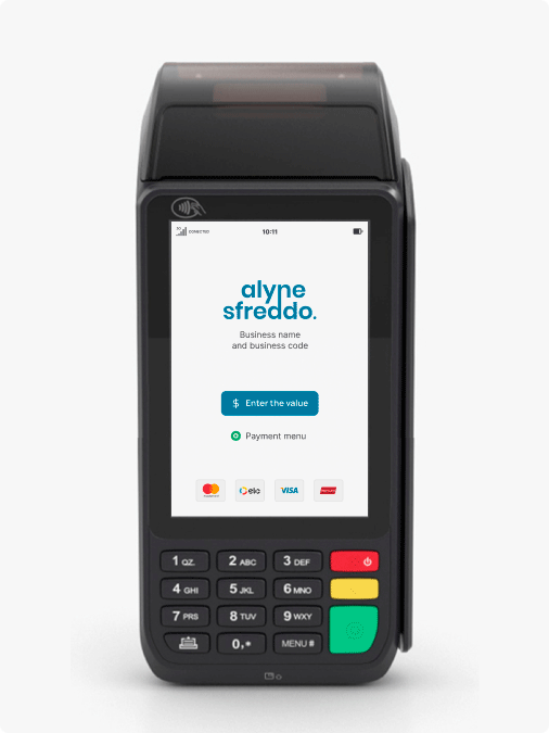
The image displays the card machine system.
Users flow
To understand the user flow while using the card machine system, I created a step-by-step process to map out the user journey. This process allowed for a detailed analysis of each stage, enabling the identification of potential pain points and areas where the user experience could be improved.

The image illustrates the user flow and interaction with the card machine.
Desk research
Through desk research, we discovered competitors and sources of inspiration such as InfinityPay and Cielo. Here are some key findings from the study:
InfinityPay
-
The user can view all menu options on the screen without the need to scroll, ensuring easy access to all submenus.
-
Icons are used to represent titles, aiding users in quickly identifying different operations.
-
The size of the buttons is suitable for touch screens, promoting ease of use.
-
The interface is visually appealing and user-friendly.

Cielo
-
The latest devices feature shortcuts on the main screen to assist users in accessing payment options more conveniently.
-
Cielo's interface ensures sufficient accessibility in terms of color contrast and font size.
-
The content is well-organized, and the system demonstrates a thoughtfully designed information architecture.

The image displays the InfinityPay card machine system.
The image displays the Cielo card machine system.
Define
After conducting the discovery phase, we have identified several problems present in the current card machine system and outlined key areas for improvement.
The system needs to have better accessibility and usability, as well as good color contrast, adjusted button sizes, and improved UX writing.
Providing feedback on user activities and enabling the ability to undo actions are essential aspects that need to be incorporated into the system.
It is necessary to guide users through the use of shortcuts or icons to enhance their navigation and improve their overall user experience.
Develop
Based on the previous specifications and drawing inspiration from the client's Design System, I designed the card machine system using the Web Content Accessibility Guidelines (WCAG) to ensure that the interface meets approved accessibility criteria. Additionally, I organized the information architecture of the menu and screens. Furthermore, in collaboration with the UX writing team, we made adjustments to enhance the user's experience by improving the text elements.
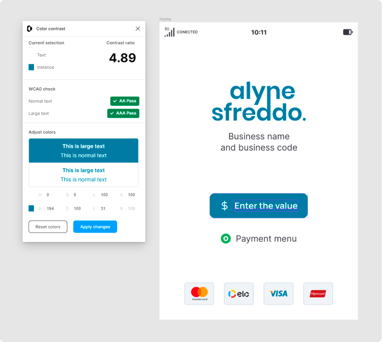
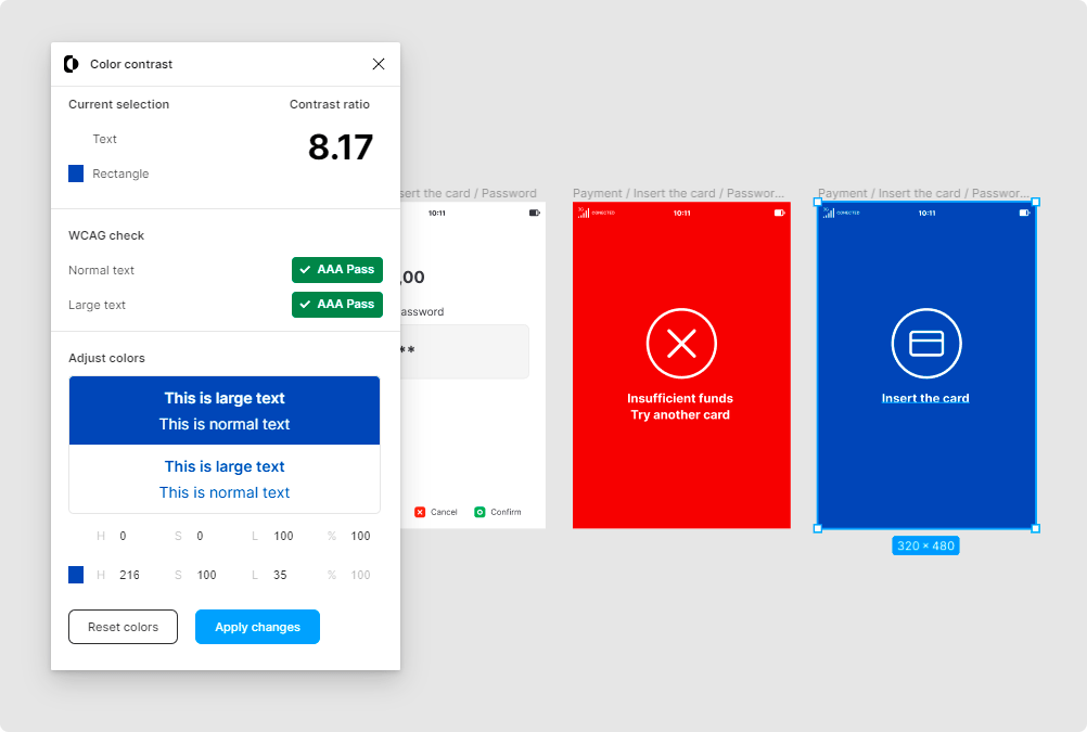
The images illustrate the accessibility analysis conducted using the Color Contrast plugin.

The image displays the prototype and interactions within the Figma file.
Deliver
After validating the final flow with the Product Owner, I made the last iterations and finalized the version that would be used as the Minimum Viable Product (MVP). The validation process was instrumental in understanding the client's needs and making any necessary adjustments to the system.
The animation showcases the flow of an approved payment.

The image displays the flow of a card declined transaction.