White-label Design System Beta version
The white-label model ensures a quick time-to-market and enables companies to rebrand their systems effortlessly. Additionally, it offers cost, time, and resource savings by eliminating the need for designing tools, apps, and websites from scratch.
As a Product Designer, my role involved delivering a solution that streamlined the development of customized payment platforms for one of the largest acquiring companies in Brazil.
I have omitted confidential information from this case study to comply with my confidentiality agreement. I translated the texts on the screens from Portuguese to English for reference.

The challenge
This project was initiated due to a lack of a pattern for creating new interfaces and experiences within the client's multiple platforms. The Design team consistently invested significant time and resources in developing components for each project without any established patterns. This lack of consistency not only resulted in inefficiencies but also led to wasted time and financial resources.
Overcoming this challenge required a strategic approach to develop a unified pattern that could be followed across all interfaces and experiences, streamlining the development process and ensuring a consistent and efficient user experience.
Discover
Components inventory
My initial task involved creating a component inventory based on the client's existing platforms. I organized the inventory into the following categories:
-
Tokens
-
Support library
-
Core components
-
Team components
Following this, I proceeded to map out all patterns, analyze inconsistencies, and identified varying styles across the systems. Some examples of inconsistencies included:
-
Varied widths and heights of buttons
-
Inconsistent border-radius
-
Diverse font styles
-
Discrepancies in colors
-
Inconsistent spacing
-
Differences in writing styles
-
Varied margins
These findings highlighted the need for standardization and alignment across the systems to ensure a cohesive and consistent user experience.
Design and marketing alignment
We shared the component inventory and inconsistencies with the Marketing team. Following that, we proposed improvements to align with the branding and enhance accessibility.
Some of the agreed-upon improvements with the Marketing team were as follows:
-
Expanding the color palette and selecting shades that offer improved contrast.
-
Implementing pixel-perfect icons.
-
Choosing an optimized web font family.
After the initial delivery, we made the decision to create different themes to allow customization for other businesses.
This alignment between design and marketing aimed to ensure a cohesive and visually appealing brand identity while prioritizing accessibility and customization options for a broader range of businesses.
Define
To ensure consistency and efficiency, we established the elements that would compose the Design System, including tokens, core components, and team components. This approach empowered our team to create a system that upholds a unified visual identity, enabling us to deliver top-quality work in alignment with the client's vision.
We determined that the initial delivery would comprise components based on the client's branding. In subsequent deliveries, our
plan is to delve into the creation of themes, allowing for further exploration and customization possibilities.

The image depicts the structure of the Design System.
Develop
Central Design System
Tokens
Drawing from the inventory and brand guidelines, I established the tokens for the central Design System. Tokens serve as the foundational values necessary for constructing and maintaining a Design System and are represented as data. These tokens include:
-
Colors
-
Border-radius
-
Spacing
-
Fonts
-
Font size
-
Margins
Tokens form the basis for further development within the Design System. At this stage, I collaborated with the Design team to make important decisions that enhanced the project. These decisions included:
-
Adjusting the branding color palette to ensure good contrast, segregating them into primary and secondary colors
-
Creating a neutral and feedback color palette
-
Establishing a default border-radius of 4px
-
Selecting the Roboto font family as the default for all digital products
-
Defining default shadows, spacings, and grids
These choices served to reinforce the consistency and cohesion of the Design System, enabling a streamlined and efficient design process.

The image displays examples of the Design System's tokens, including colors and fonts.
Core components & Team Components
Taking into account the inventory and tokens, I designed the core and team components in the Figma tool, addressing the previously mentioned accessibility issues.
The core components serve as foundational elements that can be utilized by all products and brands. Their primary purpose is to accelerate development time and minimize maintenance costs for digital products. Examples of core components that I created for this Design System include:
-
Buttons
-
Cards
-
Calendars
-
Dialogs
-
Filters
-
Icons
-
Inputs
These core components provide consistency and reusability, ensuring a cohesive visual language and user experience across various digital products.

The image displays some core components, including the calendar and dialog.
In addition, I incorporated Team components into the Design System. These components are customized specifically for a particular product or brand, featuring unique user experiences. They encompass various design elements, such as distinct menu and header styles, icons and illustrations, as well as additional components like buttons or cards. By including these specific components within the Design System, our team was able to streamline their workflow and ensure consistency across their digital products.
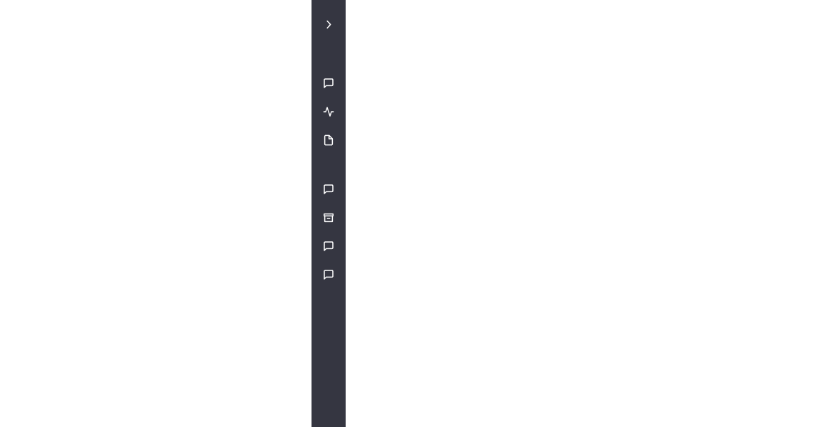
The animation illustrates a lateral menu, which serves as an example of the Design System's team component.
Deliver
We finalized this task by creating a document containing additional information about the central Design System. Subsequently, we presented this document to the client's development team, highlighting the significance of the project in our daily work. This presentation helped emphasize the importance of efficient and consistent interface creation, ultimately enhancing the scalability of the client's products.

The image showcases several pages of the Design System, highlighting various elements such as chips, pagination, toggle switches, and brand colors.
Themes
For the second delivery, I created two additional themes that feature unique design elements, fonts, and color schemes. These themes can be easily customized by modifying the brand colors and logo, enabling businesses to align their brand identity with a custom solution and expedite their route to market, resulting in time and cost savings.
The themes were organized into separate Figma files, facilitating easy customization and modification without affecting the main design.

The image displays the libraries within the Figma file, showcasing the card component from each theme.
The themes are:
Default
This theme aligns with the client's brand identity and features semi-rounded edges, creating a friendly and professional look. The font family chosen for this theme is Roboto.
Creative
The Creative theme incorporates rounded edges, giving it a trendy and playful appearance that embodies innovation. The font family used for this theme is Inter.
Fun
The Fun theme showcases fully rounded edges, creating a friendly and creative look that adds a positive impact to the interface. The font family selected for this theme is Manrope.
Please note that these themes are still in the development stage and may undergo changes or updates before they are finalized and ready for implementation.

The image displays the themes Default, Creative, and Fun.