
WEBSITE & UI DESIGN
Making caregivers visible within the healthcare system
Project developed at One Net Inc.
THE CHALLENGE
From invisible roles to recognized care partners
Family Caregivers of BC supports unpaid caregivers, family members and friends who provide essential care, often without formal recognition or resources. Many caregivers remain invisible within the healthcare system, despite playing a critical role in patient outcomes.
The “Refer a Caregiver” initiative was created to encourage healthcare providers to identify and support these individuals. The challenge was to communicate this clearly and make the referral process simple and immediate within a busy clinical context.
THE AUDIENCE
Healthcare providers across BC
Who they are

→
Family physicians, nurses, and allied health professionals in British Columbia
→
Working in clinics, hospitals, and community settings
→
Often the first point of contact for patients and their families
Context

→
A quick way to identify caregivers within patient interactions
→
Access to support resources without adding complexity to their workflow
EXPLORATION
Making information easier to act on
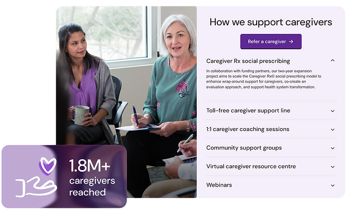
I designed the campaign landing page with content leading the experience. The page needed to communicate multiple ideas at once, who caregivers are, why they matter, and how to refer them, while staying clear, direct, and easy to navigate for busy healthcare providers.
The page follows a simple flow: Identify → Refer → Engage, breaking the process into clear steps that fit naturally into the way providers already work. Sections are structured into scannable blocks, with icons and data highlights helping communicate key information quickly.
The design brings focus to key messages such as system impact, caregiver burnout, and referral benefits, making them easier to understand and act on.
SOLUTION
Expanding the visual language
The existing brand was expanded to support the campaign, with a focus on clarity and usability rather than redesign.
The color palette introduces clearer hierarchy across sections, helping differentiate types of information. Data points such as caregiver statistics and system impact stand out to reinforce urgency, while icons help with quick recognition of actions and services.
Layouts handle large amounts of content without overwhelming the user, using consistent patterns that make information easier to scan and navigate.
The result is a more functional and adaptable system that works across different contexts.


Bringing it into real-world use
The same structure and visual logic carry over into a printed brochure, translating the landing page into a format that fits clinical environments and supports quick referral during in-person interactions.
This keeps the experience consistent across digital and print, while adapting the format to how the information is used in real-world settings.
